
(This is the fourth post in our Open Source At Large series.)
All the power of open source comes from throwing in with your neighbors, even the neighbors you don't like very much. For most projects, the main reason to get involved in open source is to create productive relations with as many participants as possible, including rivals. Doing this well requires understanding who is in your ecosystem and how they relate to each other.
Whenever a team comes together to plan their open source strategy, they need a way to gather that understanding. They want to pool their knowledge and get everybody working from the same set of facts. The best tool we've found for this is ecosystem mapping.
There are many ways to visualize groups of stakeholders. We generally recommend starting with who and going from there to what. You can capture users, contributors, service and support providers, partners, funders, investors, deployers, integrators, and competing or adjacent efforts. Grab anything important to the questions directly in front of you, and don't worry about being complete.
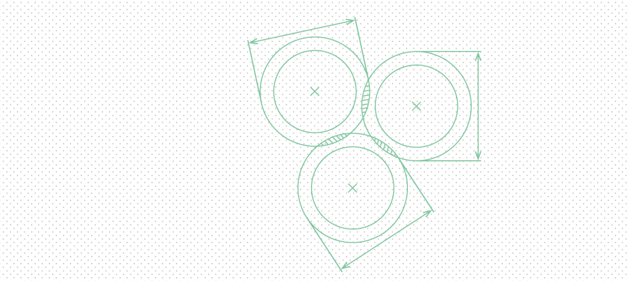
Ecosystem maps are lightweight. They should be messy, quick, and replaced often. The best way to make one is to hand-draw it on a large piece of paper or on a whiteboard, ideally as a group exercise. Snap a pic for future reference, but don't bother taking the time to redraw them neatly. In a fast-moving project, the terrain these maps describe will shift often. And the reasons why you might draw a map will change even faster. It is not unusual to make several different maps of the same ecosystem in an afternoon.
Here is a simplified version of an ecosystem map drawn by the Arches Project. (We reproduced it in Dia for this article, but normally we wouldn't bother to digitize a map, beyond photographing the whiteboard or paper it was drawn on.)
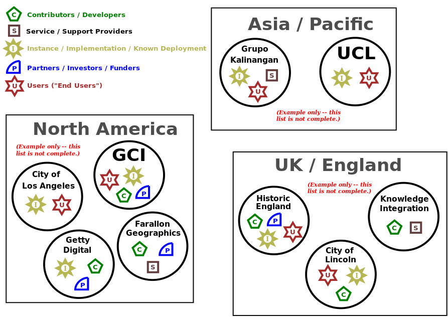
Notice how the diagram is primarily designed to highlight geography but also uses color and shape to distinguish between different types of participants.
The day the team drew this map, we wanted to understand where the project was succeeding geographically and how to support participants spreading the project into new communities. We suspected that having a set of committed users and service providers doing custom deploys were both important, so we mapped it to kick off a group discussion. As we talked through planning, we referred to the map, adjusted it at times and later even drew another map with a new focus. The diagram was a guide for conversation and let everybody agree on parameters quickly.
This is a map drawn of the Tor Project by Dlshad Othman:
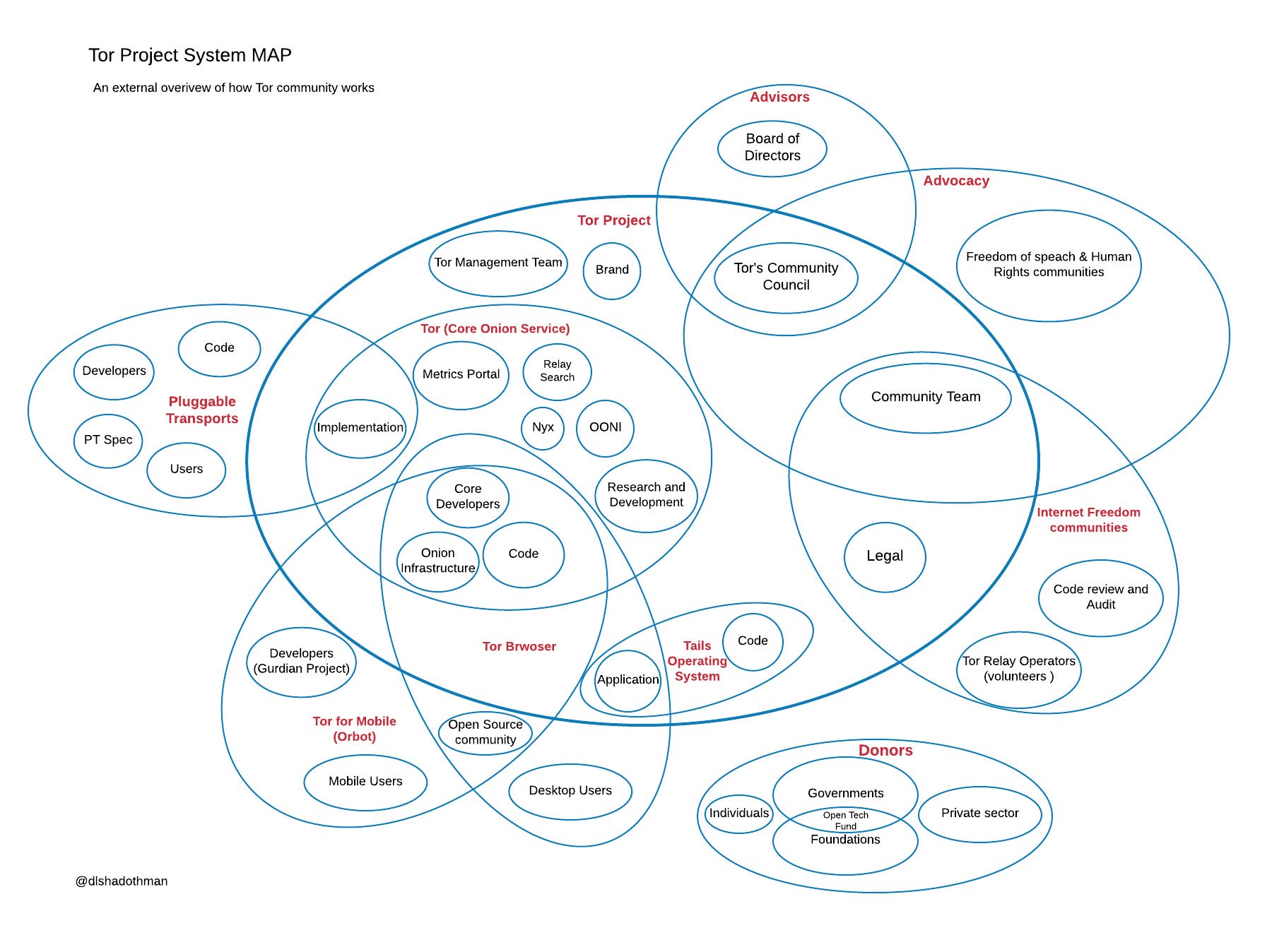
This map is more centered on interactions with the Tor Project. It doesn't mention geography at all, and it uses enclosing shapes to group types of participants in a venn-diagram. It shows roles and relationships with a heavy focus on the project itself.
There is no one right way to draw an ecosystem map. There are, however, some signs that your map is not set up to capture relationship complexity:
- It is shaped like a star, with all your connections coming back to one central entity.
- It is more of a cloud than a map. If the map doesn't depict relationships between entities, it's not doing its job.
- It tries to answer too many questions at once. Maps are usually single-use snapshots designed to highlight one aspect of your ecosystem. As two-dimensional representations made quickly with a limited palette of colors and symbols, these maps can show complex relationships, but not easily accommodate high-cardinality data views.
That said, do whatever works for your purpose! Experiment with different techniques, and draw maps that highlight different types of information. If you make a map using some of these techniques, let us know in the comments. We’d love to see pictures of maps that might turn into future examples as we continue to help people apply this approach to crafting open source strategy.
Thanks to Microsoft for sponsoring the Open Source At Large blog series, and also to Dlshad Othman and the Arches Project for kindly letting us use their maps as examples.